This post documents the production and creation of the final practical pieces that would lead to the final outcome of the project; an art book. From the very start of the project, an art book was to be the final outcome. Books are important and special in this modern world of fancy phones and tablets; they not only provide a link to the past, but just feel ‘right’ when being held and read. This feeling creates the mythology behind books, it’s what makes them superior to modern technology, if only in a nostalgic way. Fitting then, that a project concerning mythologies and comparing the new to the old would have a book as the outcome.
Before the book itself could be created however, it was necessary to fill out the content and create as many concepts and final pieces to a high standard as was possible within the time frame. The book itself needed to be finished a good 2 and a half to 3 weeks before the degree show where it would be on show and this in turn would also allow time for the dissertation to be written. As this is post commentary, I shall go through the contents of the book in the order that they appear, seen as I can't actually remember what order things were actually done in (the last few weeks have been a blur of Copic markers, tiredness and frustration).
Anatomical studies and reference drawings
To add to the small collection of reference drawings that I had done, I took a trip down to London to visit the Natural History Museum and the Zoo (also The Making of Harry Potter, but that isn't quite as relevant). The Zoo and Museum were quite disappointing when I got there and a lot of frustration was to be had being stuck in London for 4 days. The problem with the Museum was that it was incredibly busy and there was no place to sit in front of the taxidermied animals to draw; even then, the animals looked very old and decrepit and weren't worth drawing from really. I took a good number of photographs at both there and the zoo to work from when I got back from the trip, so all was not lost. Using these photos, I drew a variety of animals, referring to my list of folklore creatures that I might draw ones that would actually be of use.
 |
| reference photos moodboard |
 |
| frogmouth, boar, turtle/tortoise/thing!?), hare |
 |
| bearded pig, elephant, tiger, rhino |
 |
| ancient relative of modern horses, stag |
These drawings were then rendered in grey-scale using Copic markers. The colours used are from the warm grey selection, which I find very pleasing for creating a neutral tone and I use on pretty much all my images before adding colour (unless I am using the cool grey range to do the same thing). Copic markers are my favourite thing at the moment, though the main problem is the inability to simply go out and by them or their refills, meaning that you won't know if a marker is going to run out until it does, leaving you somewhat stranded for a good few days.
 |
| frogmouth, boar, turtle/tortoise/thing!?), hare |
 |
| bearded pig, elephant, tiger, rhino |
 |
| ancient relative of modern horses, stag |
Folklore creatures
Moving forward, it seemed prudent to start working towards designing creatures from folklore due to that of course being one of the focal points of the project. Though initially it was decided upon that both Celtic and Asian folklore would be used, time scales prevented all this being possible and so a small selection of creatures chosen from an extensive list of just Celtic ones, found on Wikipedia, would make up what was intended to be a small eco-system of creatures.
The final chosen ones were:
Afanc - lake monster resembling a crocodile or beaver, said to be a demon.
Bauchan - a type of hobgoblin.
Boobrie - shape-shifting entity that can appear as a giant water bird, bull or horse.
Ellen Trechend - a monstrous three headed fire-breathing bird.
Twrch Trwyth - an enchanted wild boar.
Water Leaper - an amphibious chimera with a frog's body, a bat's wings and a lizard's tail with a stinger at the end.
The initial sketches were done at nights on the London trip, as shown in this collaborated image below.
These were of course then followed by more refined sketches of 4 of the creatures that were chosen from the list: the Afanc; Bauchan; Boobrie; and Water Leaper. At this point, it was noticed that the creatures being designed were somewhat amusing and unwittingly seemed to take inspiration from the works of Terry Pratchett and the renowned artist, Paul Kidby who made such stories come to life through visuals. Looking through the book, The Art of Discworld, it became apparent that this would indeed act as a point of inspiration for this miniature fictional eco-system and the goal became to design folklore creatures with the intention of creating something humorous with a hint of adventure.
 |
| Afanc and Bauchan |
 |
| Boobrie and Water Leaper |
 |
| Afanc and Bauchan tonal |
 |
| Boobrie and Water Leaper tonal |
 |
| Bauchan, Water Leaper, Afanc and Boobrie, coloured |
The final stage of the folklore part of the project project was to create an end piece utilising the creatures that had been designed. With the humorous adventures concept inspired by Terry Pratchett and Paul Kidby, the final image as shown below was produced to show a Bauchan frantically riding a Water Leaper away from a predatory Boobrie.
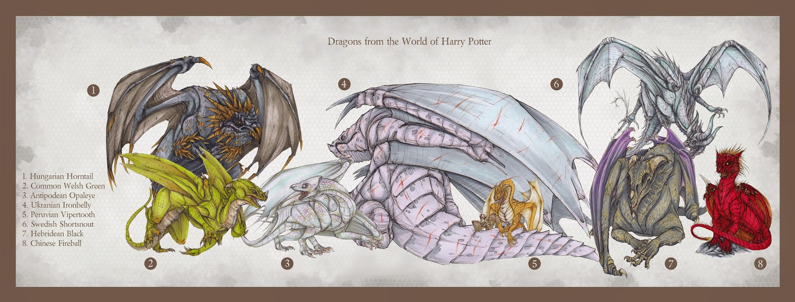
Harry Potter Dragons
As such a large part of the early stages of the project and with the project having an emphasis on dragons as a key subject, it made sense to carry on the work that had been started and lead it into a sort of culmination that could be put in the final outcome; the art book. The four dragons from the Tri-Wizard Tournament event in the fourth Harry Potter book were carried on to create more refined anatomical images of them; the Swedish Shortsnout, Common Welsh Green, Chinese Fireball and Hungarian Horntail. Shown below are the original sketches of them that were then used to inspire the final versions.
 |
| Swedish Shortsnout |
 |
| Common Welsh Green |
 |
| Chinese Fireball |
 |
| Hungarian Horntail |
Using these images as reference, final concepts of each of the dragons were created; drawn in pencil, scanned and printed before being coloured with Copic markers and finally returned to the digital realm in order to clean them up and fix the colour desaturation that the scanner causes. These final images and their original sketches are shown below.
 |
| Swedish Shortsnout |
 |
| Swedish Shortsnout |
 |
| Common Welsh Green |
 |
| Common Welsh Green |
 |
| Chinese Fireball |
 |
| Chinese Fireball |
 |
| Hungarian Horntail |
 |
| Hungarian Horntail |
The anatomical images of the Tournament dragons were then redrawn and rendered using the Copic markers in the same method as described above. Each dragon had its skeletal and muscle structures realised and became a key example of what had been learned of the anatomy of creatures that can attain flight.
 |
| Swedish Shortsnout Skeletal Structure |
 |
| Swedish Shortsnout Musculature |
 |
| Common Welsh Green Skeletal Structure |
 |
| Common Welsh Green Musculature |
 |
| Chinese Fireball Skeletal Structure |
 |
| Chinese Fireball Musculature |
 |
| Hungarian Horntail Skeletal Structure |
 |
| Hungarian Horntail Musculature |
To further the content of this section of the project, more refined concepts of the other dragons within the world of Harry Potter, previously sketched early in the project, were created and, again, coloured using the Copic markers.
Finally, a size chart was created using the appropriate dragon concepts that had fully defined and coloured forms; meaning the Romanian Longhorn and Norwegian Ridgeback were not included unfortunately.
Realistic Pokemon
Another part of the project that was continued on was the area of realistic Pokemon; interpreting the anime creature designs by applying real world anatomy to them. As already established, there are two groups of the Pokemon that were designed: Axew, Fraxure and Bagon; and Deino, Zweilous, Hydreigon and Dragonite.
The former group, featuring Axew etc., were revisited first and more refined concepts were created from them, based on the initial designs. As with the Harry Potter dragon images, these too were rendered using Copic markers and used the method of scanning and printing to ease the process. The main aim for this part of the project was to not only to improve anatomy skills, but also improve the ability to apply real world anatomy to stylised designs.
Using the Pokemon concepted here, a scene was constructed to show a conflict between a pair of Bagon and a Haxorus who is defending two young Axew from their hungry attackers.
Following on from the first set of Pokemon, the second set featuring the Deino evolutionary line was also re-conceptualized.
As with the first set, a final image of a conflict was created, featuring a Hydreigon attacking a Dragonite over the sea. This image also shows the grey-scale process mentioned previously, as well as an alternate colour scheme for the 'shiny' versions of the two Pokemon present. Shiny Pokemon are essentially the same as normal ones, but with a rare skin pigmentation that offers a visual difference; making them highly sought after.
Evolve Shepherd (Fenrir)
Another key part of the beginning of the project was the designing of a creature to fit within the game world of Evolve. The final outcome of this part of the project was to take the best working concepts and refine them before rendering them with Copic markers. This way, the initial sketches became far more valuable and were used also as colour studies that became useful in deciding the final scheme for Fenrir the Shepherd.
Warhammer Creatures
The final practical section of the project, before all the materials were to put together into one single outcome, was based around the fantasy world of Warhammer and futuristic universe of Warhammer 40,000. The project had dabbled in this area earlier, with sketchy concepts for the race of rat-men known as Skaven, but was in need of a significant quantity and quality boost. From Orks, to Lizardmen and Daemons, the goal was to apply a personal style to a wide variety of creatures, attempting to not linger on any particular type of creature and aiming to stay away from the big reptiles, seen as dragons had played a large part of the project already.
As with other parts of the project, more 'final' images were wanted, so the final concepts produced were of a Tyranid Hive Tyrant and two Skaven. Both races are personal preferences within the Warhammer 40,000 and Warhammer universes respectively, so it made sense to make them final pieces.
With all the images created for the final book, it was time to put it together using Jessops' Cewe Photobook. I shall make a post commentating on the trial run book as well as the final outcome.