And so, without further ado:
* NOTICE! The formatting is all messed up for some unknown reason and I have spent ages trying to fix it; it's not for happening, so I'm afraid it will just have to be read as is! *
Where It All Began

One of the first true inspirations for my work was the cover of ‘Harry Potter and the Goblet of Fire’, by illustrator Giles Greenfield. Already a fan of the series by that point, when the fourth book came out in the year 2000 with a large dragon splashed across the cover, I was hooked. I would always use this cover as a reference when I was younger and drawing dragons; it was just perfect to me and formed a deep nostalgia that I still hold to this day. The image itself depicts Harry competing in the Tri-Wizard Tournament, during the first task in which the champions must steal a special egg from a dragon’s nest; Harry’s dragon is a Hungarian Horntail.
Looking at the cover, I was always far more interested in the dragon than Harry and looking at it now from a critical point of view, it looks very much as if both the dragon and Harry are of equal value; sharing the same colour palette, level of detail and contrast. Continuing to look critically at the image, the dragon itself looks somewhat anthropomorphic, featuring almost human limbs, and especially the hands, having 5 long fingers, seem incredibly human also. From a technical point of view as a creature designer, it seems very out of place and doesn’t quite work. The horns atop its head too seem out of place; they are perhaps too small or
should be located further down on either side of the
head. And yet, it works overall as a piece, making it
particularly malevolent and creepy. It’s an exciting image with action and
energy regardless of its technical issues, and for this reason it is
successful.
As to how it relates to my work and project, it shows that
adapting a creature from text does not necessarily mean sticking to the letter.
It is far more important to have a degree of personal creativity and make
something that looks how you want it to look, without compromising on what the
client requires of course. It also shows that sometimes getting the feeling
right is what’s important in an image; my earlier critical quibbles can easily
be cast aside for the main point that anatomical accuracies can be sacrificed, to
an extent, in order to get across the emotions you wish to portray to the
viewer. Taking these concepts into my work will be crucial for me, as it should
help working more loosely and not getting caught up in the ‘nitty-gritty’ until
such details are needed, aiming instead for powerful pieces and designs that
stand out.
The Edge Chronicles
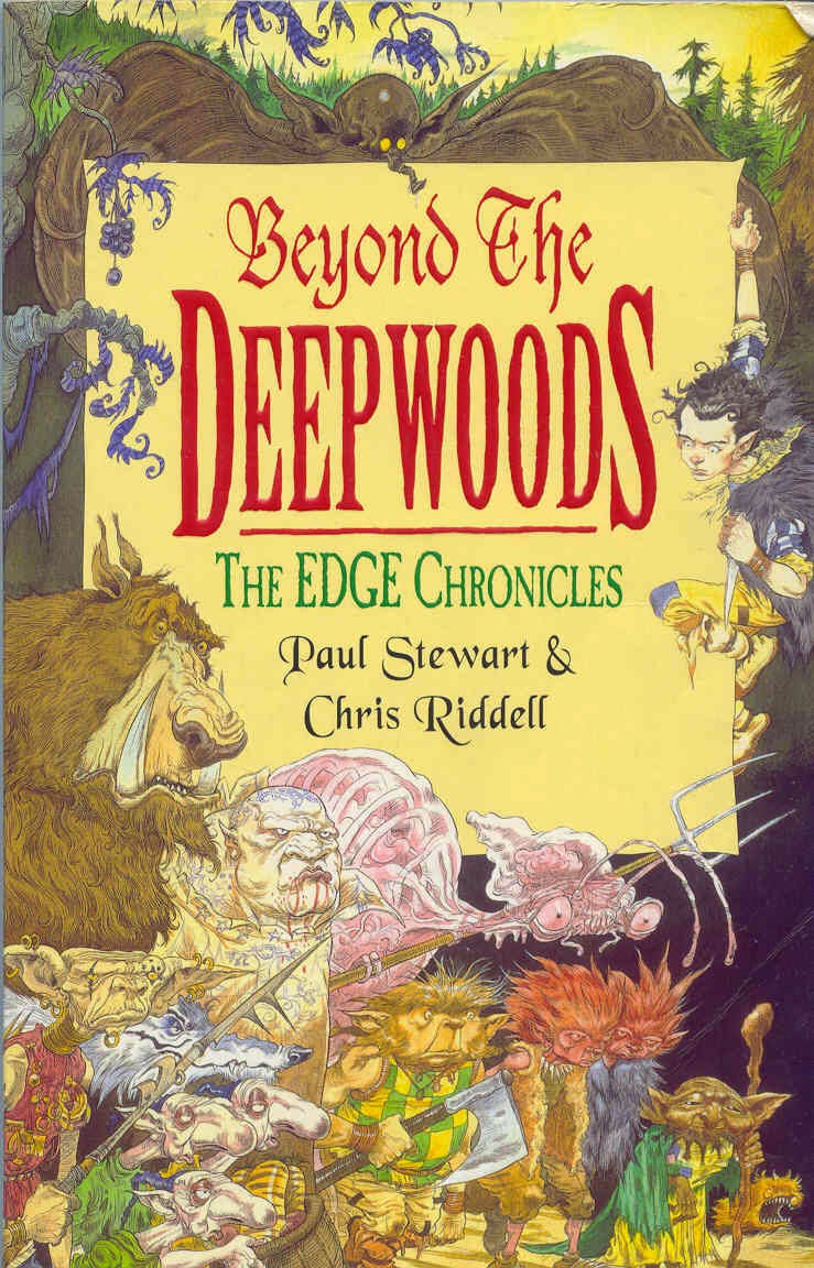
From a technical point of view, Riddell’s artwork is phenomenal; every one of his characters and creatures are full of life and personality. It helps of course that his style for this is somewhat cartoon-like, but even so, he uses realistic proportions and convincing designs that could easily be believed to be real. The sheer variety in his designs as well (helped by the extensive descriptions in the book) shows what a talented artist he is, breathing true life into each and every weird and wonderful creature and character. The style that he utilises is perfect for this type of book; that of a
children’s novel in which there are many threatening situations and brutal happenings, creating a fantasy adventure that shows what it would really be like to be cast into a terrifying world full of beasts and baddies.
What makes this so interesting to my project is mainly
that it is oft left to the reader’s imagination as to how characters, creatures
and environments are perceived, basing these imaginings on the text. The
problem with this is of course that some writers don’t go into great depth with
descriptions, leaving it very wide as to how something may look. This then
leads onto the next problem, which is that everyone will have their own
interpretation as to how something should look and of course, their image is
right, to them at any rate. In turn, this leads to the project’s topic of
adaptation. If all the imagery is left to the reader’s imagination, should a
visualised piece be produced, such as a film or graphic novel, it will most
likely be disappointing to them, from a visual stance at any rate. However,
what makes ‘The Edge Chronicles’ series interesting is that as pointed out,
there are illustrations throughout the book, showing each and every character
and creature, so if it were to be adapted, readers would not be disappointed as
long as it stuck to the original designs.
This idea helps from a theoretical point of view, but
Riddell’s work also helps from a practical point of view as well. His art shows
that I can maintain consistency with the realistic style I aim for, whilst
still being able to add a lot of character to the creatures I am creating
through slight exaggeration of features.
Queen of Creatures


The art of American artist, Terryl Whitlatch, has only become truly apparent to me in the last couple of years. Yet I have unknowingly had one of her art books since I was quite young; ‘The Wildlife of Star Wars’. Since realising this, as well as finding my love for her work, she has been a great inspiration. I have always loved creatures and for me, her art exemplifies exactly what I seek to
emulate within my own drawings; a sense of realism.
Looking at Whitlatch’s work in a technical way reveals just how well-crafted and inspirational it truly is. Her grasp of animal anatomy is near flawless and her ability to create fictional creatures that still look as though they could actually exist is exceptional too. To find any flaws in her work for an
amateur like myself seems near impossible. The 2 examples given show this skill off just as well as any of her other pieces. If I could give one criticism, it would be that some of her designs look slightly like a cut and paste of different creatures put together. An example of this would be in the top image which looks like a dinosaur’s head on a lion’s body and with bird wings attached. At the same time, it is still an exceptional design and could be believed to exist or have existed.
Attempting to maintain all these thoughts and ideas is of
course important, but it should be recognised that my own creative style and
stance, as well as other influences will permeate my work; Whitlatch’s
teachings could be seen as a sort of grounding basis from which I can direct my
own path.
Monster Menagerie


Monster Hunter is a game series that has enthralled me for years. It focuses primarily on the player as
a hunter who must go on quests to defeat increasingly difficult monsters. It is of course the monsters themselves that have me glued to the game, with well over 100 different monsters, not including all the sub-species and variant types. Shown here are just 3 such example of the extreme variety in the appearance and abilities of the monsters within the games. From the top: Zinogre; Kecha-Wacha sub-species; and Brachydios.
being based on real-life creatures and portray realistic anatomy. Many of the creatures however, push out the boat when it comes to how much fantasy element is put into them; to the benefit of most; but to the detriment of others. Those that it benefits become far more interesting in design and look impressively unique. Those where it is a detriment however, become almost unbelievable and somewhat jarring to the eye, in comparison to the other ones. Of course, this might not necessarily be a problem if the intention behind them was not to make them believable and just to focus on making them interesting to fight
and look at. It does, however, remove some of the immersion when a creature such as Brachydios (bottom image) is placed in a volcanic environment featuring predominantly reds and browns, when the creature itself uses a blue and green scheme.
What this brings to my project is more practical-based theories and concepts. It helps to show that the fantasy elements in a design can be pushed further, whilst still in keeping with the desire to create realistic creatures. It also shows that the environment in which a creature is placed is incredibly important for determining how it
would fit in; if it looks out of place, either it’s a design
flaw, or it was intended to be an alien to the
environment and contrast with it to give it some context or back-story. This
also makes for an interesting case that my project can benefit from; that the
story of a creature, how it acts, lives, hunts etc. can be a solid grounding
for how a creature should be designed and what main anatomical features it
should be equipped with. Finally, the colouration of creatures is important and
can be used as something to enhance the fantastical elements in a design; even
garish colours can be used appropriately as exemplified by poison dart frogs in
nature.
Gotta Design ‘Em All!


Pokemon was a massive part of my childhood; the cards, the games, the movies, the figures, I loved it. What’s more, all these years on and I still enjoy it as much as I ever did, if not more. A franchise based primarily on a wide variety of creatures, it seems clear then as to why it has struck a chord all this time and as to why it would be such a source of inspiration for my project. Of course, Pokemon is all in an anime/cartoon style, which doesn’t fit in with the way I like to work,
but it is the ideas and concepts that are important. In steps one R.J. Palmer who has taken it upon himself to visualise these cartoony creatures into realistic beasts, based on animals that
exist in our own world. Having released
a book titled ‘Realistic Pokemon’, I made sure to get a copy, as this is exactly the sort of thing I would like to produce as a final piece for my honours project.
Looking at the book itself and how the contents are arranged will help to give an idea as to how I might go about creating my own version with different creatures of course. Looking critically at it, I like the way in which the book includes sketches
alongside the final pieces as shown in the second image, however, there is very little actual concept work; it mostly consists of what the final image will look like, pre-painted. Adding extra Pokemon to the images helps to add more interest to the
page and give an idea of scale. This is further enhanced by the Pokemon trainer scale figure Palmer has used alongside each of his images. The text that coincides with each image is
something that bothers me with the book; Palmer’s language is very casual and he often complains about the original Pokemon designs of many that he is making realistic, for example: ‘Glaceon is dumb’. This, to me, is very unprofessional
and could easily be put across in a more formal manner that explains why he
dislikes them as opposed to just childish insults.
|
The designs of the Pokemon themselves are very
interesting though and lend themselves to my aim of creating realistic
creatures. A particularly good example of Palmer’s creativity is that of the Gengar
evolutionary line (bottom picture). Gengar and its previous forms, Gastly and
Haunter, are all ghosts with no true real-life basis for their designs. Palmer
has been incredibly clever and made them into bat creatures; giving them a
distinctive form and making them realistic in the process, whilst still
maintaining a strong semblance of their original designs.
For my project, this brings a very plausible conclusion
and outcome. Creating a book of creatures, in particular the various dragon
species from the world of Harry Potter, would be a very professional thing to
have if done in the right way. Taking what I have learned from this book, I
would be sure to include as many concept sketches as possible to give readers
an idea of the way in which the creatures evolved. I would also be sure to
include other creatures to coincide with the main focus on each page to add
character and perhaps hint at a sort of food-chain. Furthermore, a scale
character would be incredibly useful to help relate the size of each creature
to the viewer; numbers are on thing, but they don’t give a real idea of the
exact size of something. Finally, text would be included to describe each
creature, including ideas and opinions, but ensuring a level of quality in
writing is maintained to come across as both academic and professional.
The designs of Palmer as well help to show me to think
outside of the box with designs and the direct route might not always be the
best one. This helps to coincide with the idea that iteration is incredibly
important and the first idea will almost never be the best.
