Wednesday, 22 April 2015

The Final Push

This post documents the production and creation of the final practical pieces that would lead to the final outcome of the project; an art book. From the very start of the project, an art book was to be the final outcome. Books are important and special in this modern world of fancy phones and tablets; they not only provide a link to the past, but just feel ‘right’ when being held and read. This feeling creates the mythology behind books, it’s what makes them superior to modern technology, if only in a nostalgic way. Fitting then, that a project concerning mythologies and comparing the new to the old would have a book as the outcome.

Before the book itself could be created however, it was necessary to fill out the content and create as many concepts and final pieces to a high standard as was possible within the time frame. The book itself needed to be finished a good 2 and a half to 3 weeks before the degree show where it would be on show and this in turn would also allow time for the dissertation to be written. As this is post commentary, I shall go through the contents of the book in the order that they appear, seen as I can't actually remember what order things were actually done in (the last few weeks have been a blur of Copic markers, tiredness and frustration).


Anatomical studies and reference drawings

To add to the small collection of reference drawings that I had done, I took a trip down to London to visit the Natural History Museum and the Zoo (also The Making of Harry Potter, but that isn't quite as relevant). The Zoo and Museum were quite disappointing when I got there and a lot of frustration was to be had being stuck in London for 4 days. The problem with the Museum was that it was incredibly busy and there was no place to sit in front of the taxidermied animals to draw; even then, the animals looked very old and decrepit and weren't worth drawing from really. I took a good number of photographs at both there and the zoo to work from when I got back from the trip, so all was not lost. Using these photos, I drew a variety of animals, referring to my list of folklore creatures that I might draw ones that would actually be of use.

reference photos moodboard

frogmouth, boar, turtle/tortoise/thing!?), hare

bearded pig, elephant, tiger, rhino

ancient relative of modern horses, stag


These drawings were then rendered in grey-scale using Copic markers. The colours used are from the warm grey selection, which I find very pleasing for creating a neutral tone and I use on pretty much all my images before adding colour (unless I am using the cool grey range to do the same thing). Copic markers are my favourite thing at the moment, though the main problem is the inability to simply go out and by them or their refills, meaning that you won't know if a marker is going to run out until it does, leaving you somewhat stranded for a good few days.


frogmouth, boar, turtle/tortoise/thing!?), hare

bearded pig, elephant, tiger, rhino

ancient relative of modern horses, stag


Folklore creatures

Moving forward, it seemed prudent to start working towards designing creatures from folklore due to that of course being one of the focal points of the project. Though initially it was decided upon that both Celtic and Asian folklore would be used, time scales prevented all this being possible and so a small selection of creatures chosen from an extensive list of just Celtic ones, found on Wikipedia, would make up what was intended to be a small eco-system of creatures.


The final chosen ones were:
Afanc - lake monster resembling a crocodile or beaver, said to be a demon.
Bauchan - a type of hobgoblin.
Boobrie - shape-shifting entity that can appear as a giant water bird, bull or horse.
Ellen Trechend - a monstrous three headed fire-breathing bird.
Twrch Trwyth - an enchanted wild boar.
Water Leaper - an amphibious chimera with a frog's body, a bat's wings and a lizard's tail with a stinger at the end.

The initial sketches were done at nights on the London trip, as shown in this collaborated image below.


These were of course then followed by more refined sketches of 4 of the creatures that were chosen from the list: the Afanc; Bauchan; Boobrie; and Water Leaper. At this point, it was noticed that the creatures being designed were somewhat amusing and unwittingly seemed to take inspiration from the works of Terry Pratchett and the renowned artist, Paul Kidby who made such stories come to life through visuals. Looking through the book, The Art of Discworld, it became apparent that this would indeed act as a point of inspiration for this miniature fictional eco-system and the goal became to design folklore creatures with the intention of creating something humorous with a hint of adventure.

Afanc and Bauchan

Boobrie and Water Leaper

Afanc and Bauchan tonal

Boobrie and Water Leaper tonal


Bauchan, Water Leaper, Afanc and Boobrie, coloured

The final stage of the folklore part of the project project was to create an end piece utilising the creatures that had been designed. With the humorous adventures concept inspired by Terry Pratchett and Paul Kidby, the final image as shown below was produced to show a Bauchan frantically riding a Water Leaper away from a predatory Boobrie.


Harry Potter Dragons


As such a large part of the early stages of the project and with the project having an emphasis on dragons as a key subject, it made sense to carry on the work that had been started and lead it into a sort of culmination that could be put in the final outcome; the art book. The four dragons from the Tri-Wizard Tournament event in the fourth Harry Potter book were carried on to create more refined anatomical images of them; the Swedish Shortsnout, Common Welsh Green, Chinese Fireball and Hungarian Horntail. Shown below are the original sketches of them that were then used to inspire the final versions.

Swedish Shortsnout

Common Welsh Green

Chinese Fireball

Hungarian Horntail


Using these images as reference, final concepts of each of the dragons were created; drawn in pencil, scanned and printed before being coloured with Copic markers and finally returned to the digital realm in order to clean them up and fix the colour desaturation that the scanner causes. These final images and their original sketches are shown below.

Swedish Shortsnout

Swedish Shortsnout

Common Welsh Green

Common Welsh Green
Chinese Fireball

Chinese Fireball

Hungarian Horntail

Hungarian Horntail


The anatomical images of the Tournament dragons were then redrawn and rendered using the Copic markers in the same method as described above. Each dragon had its skeletal and muscle structures realised and became a key example of what had been learned of the anatomy of creatures that can attain flight.


Swedish Shortsnout Skeletal Structure

Swedish Shortsnout Musculature

Common Welsh Green Skeletal Structure

Common Welsh Green Musculature

Chinese Fireball Skeletal Structure

Chinese Fireball Musculature
Hungarian Horntail Skeletal Structure

Hungarian Horntail Musculature


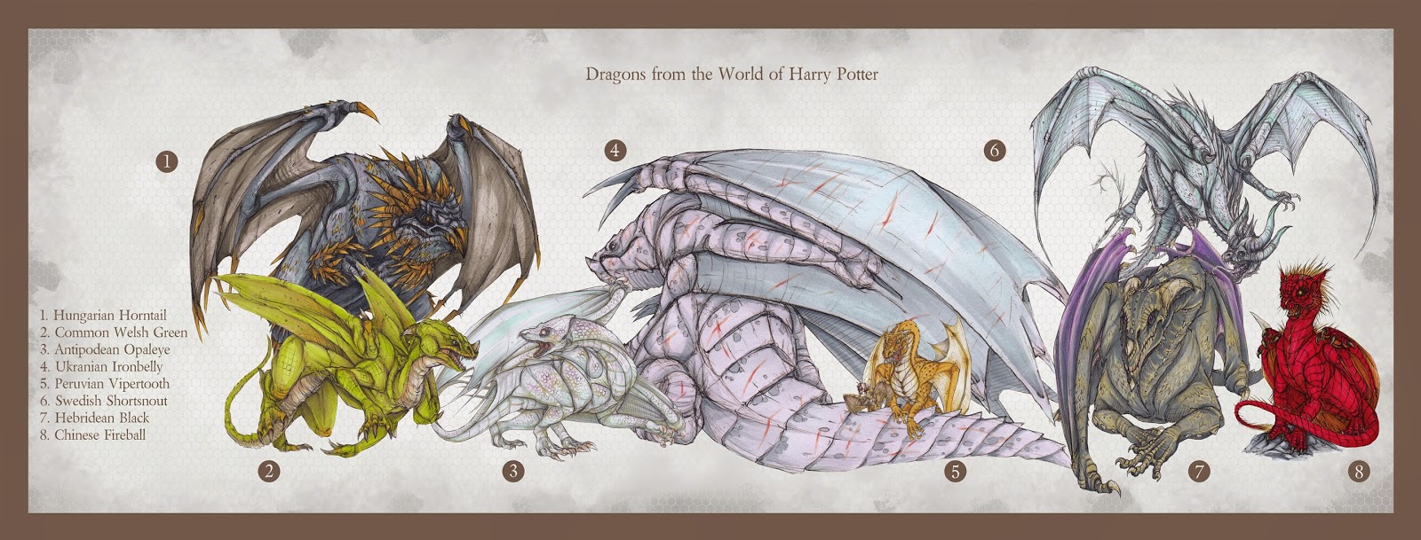
To further the content of this section of the project, more refined concepts of the other dragons within the world of Harry Potter, previously sketched early in the project, were created and, again, coloured using the Copic markers.


Finally, a size chart was created using the appropriate dragon concepts that had fully defined and coloured forms; meaning the Romanian Longhorn and Norwegian Ridgeback were not included unfortunately.


Realistic Pokemon

Another part of the project that was continued on was the area of realistic Pokemon; interpreting the anime creature designs by applying real world anatomy to them. As already established, there are two groups of the Pokemon that were designed: Axew, Fraxure and Bagon; and Deino, Zweilous, Hydreigon and Dragonite.

The former group, featuring Axew etc., were revisited first and more refined concepts were created from them, based on the initial designs. As with the Harry Potter dragon images, these too were rendered using Copic markers and used the method of scanning and printing to ease the process. The main aim for this part of the project was to not only to improve anatomy skills, but also improve the ability to apply real world anatomy to stylised designs.  


Using the Pokemon concepted here, a scene was constructed to show a conflict between a pair of Bagon and a Haxorus who is defending two young Axew from their hungry attackers.


Following on from the first set of Pokemon, the second set featuring the Deino evolutionary line was also re-conceptualized.


As with the first set, a final image of a conflict was created, featuring a Hydreigon attacking a Dragonite over the sea. This image also shows the grey-scale process mentioned previously, as well as an alternate colour scheme for the 'shiny' versions of the two Pokemon present. Shiny Pokemon are essentially the same as normal ones, but with a rare skin pigmentation that offers a visual difference; making them highly sought after.


Evolve Shepherd (Fenrir)

Another key part of the beginning of the project was the designing of a creature to fit within the game world of Evolve. The final outcome of this part of the project was to take the best working concepts and refine them before rendering them with Copic markers. This way, the initial sketches became far more valuable and were used also as colour studies that became useful in deciding the final scheme for Fenrir the Shepherd.


Warhammer Creatures

The final practical section of the project, before all the materials were to put together into one single outcome, was based around the fantasy world of Warhammer and futuristic universe of Warhammer 40,000. The project had dabbled in this area earlier, with sketchy concepts for the race of rat-men known as Skaven, but was in need of a significant quantity and quality boost. From Orks, to Lizardmen and Daemons, the goal was to apply a personal style to a wide variety of creatures, attempting to not linger on any particular type of creature and aiming to stay away from the big reptiles, seen as dragons had played a large part of the project already.


As with other parts of the project, more 'final' images were wanted, so the final concepts produced were of a Tyranid Hive Tyrant and two Skaven. Both races are personal preferences within the Warhammer 40,000 and Warhammer universes respectively, so it made sense to make them final pieces.


With all the images created for the final book, it was time to put it together using Jessops' Cewe Photobook. I shall make a post commentating on the trial run book as well as the final outcome.

Monday, 20 April 2015

Dissertation Plan

This will be a brief post outlining the topics within the dissertation and attempting to fill in sections so as to make it easier when it comes to actually writing it.

Title


Abstract

Creatures are rife within the mythology and folklore of all cultures throughout history, and remain a prevalent area of interest within modern media. Though modernised creatures may not directly link to those within mythology and folklore, their very existence is due to such tales and it is therefore important to recognise the deep roots that permeate the culture of creature design. This project looks at these roots and aims to provide a practical response to the modern media that has arisen from them.

Introduction
  • what is the project about? 
           - key questions/statements
              - interpretation of existing ideas is a key part of creature design within modern media. How does mythology play a part in this and to what extent is it utilised?
              - how do mythologies affect the methods used in creating media?
  • aims (what do you want to achieve?)
           - more in-depth knowledge of real-world animal anatomy and how it can be applied to fictional designs; focusing in particular on creatures that can attain flight.
           - a greater understanding of the relationship between mythological and modern creatures; aiming, in turn, to better appreciate all designs, no matter how far they may stray from the original source of inspiration.
  • objectives (how are you going to achieve the aims?)
           - extensive research into animal anatomy, utilising as many sources as possible.
           - research into methods used by practitioners within the field of creature design when applying real-world anatomy to fictional designs.
           - explore mythology as a concept and study examples of creature designs, both successful and unsuccessful, that stick to their origins, as well as those that diverge. 

Literature/Contextual Review
  • the importance of mythologies
           - what is a mythology?
           - wine mythology
           - why is this important to the project?
  • mythology within creature design
            - 3 states of creature design in regards to mythology

1 - straight interpretation of creatures from mythology
      - attempt to stay true to the established lore
      - modernised take on established lore
        - key example: dragons
           - sources with modernised takes: Harry Potter, Game of Thrones, Pokemon
           - sources with traditional takes: Dragonheart, How to Train Your Dragon (Toothless),
                                                           Spirited Away (Haku)
      - what do modern innovative designs mean for an artist and the fate of tradition?

2 - creatures inspired by, but not directly linked to those from mythology
         - Evolve (Kraken), Monster Hunter (Zinogre), Dark Souls (Basilisk)
      - when innovation pays respect to tradition, whilst having an emphasis on innovative design. 

3 - creatures almost entirely unrelated to mythology
      - Giger's Alien (most alien creatures in general)

            - interpretation of literature
               - Creatures with little description: Lord of the Rings (Balrog)
               - Creatures with plenty of description: Artemis Fowl (Troll)
               - relates back to artistic licence - audience expectation (understood but not explored) 
      
            - why is all this important to the project? 
  • mythology within technology
            - books vs phones/tablets etc.
            - traditional methods vs digital

Methodology
  • traditional methods
            - pencil sketches
            - copic markers
            - research gathered from books and first hand
  • digital methods
            - scanning images
            - using Photoshop as an aid to plan tone in an image
            - enhancing, cleaning up images in Photoshop
  • results of methods combined
            - final book, traditional format, created digitally

Evaluation
  • reflecting on the research outcomes of the project
  • reflecting on the practical outcomes of the project
  • if the project were to continue . . .

Conclusion

Wednesday, 25 March 2015

Progress Presentation 4

I recently had my fourth and final non-graded presentation in which I was able to discuss how far my project had advanced thanks to the breakthrough that I had had. As with the other three non-graded presentations, I shall go over the slides, what I talked about and conclude with a reflection on the experience and the feedback gained from it.


I began by introducing the new working title that I have currently developed, 'a modern look at the adaptation and interpretation of creatures derived from mythology and folklore' (still an absolute mouthful, I will need to change/shorten this).


I went on to explain about the breakthrough I had had; discussing how mythology had been circling around my project, always there but never in the limelight, until it suddenly clicked that it was the absolute crux of my entire project. I explained my theory of how modern imaginary creatures derive from mythology and read out the vision statement I had created for the project; as shown in the image below and discussed in a previous post.


Feeling good that I had explained my breakthrough well, I then went on to discuss the feedback I had been given at presentation three and how I had improved upon that. The last time I was told that there was concern my work didn't include enough digital process, so I explained how I had been using digital methods to assist the traditional ones; seeing it as an indispensable aid. I showed the images below, explaining the process of using Photoshop to create tonal versions of the images that would make using the markers in the project easier. I also discussed the use of Photoshop to clean up and enhance images.


Moving on from this, I went on to explain about my plans for the final outcome of the project; the art book, and what its contents are intended to become. As seen in the image below, I layed out the contents in bulletpoints so as to be quick to read for both myself and the lecturers present. I also included a quick sketched image of what the layout of the pages might be like, just to give them a visual clue as to what I'd be aiming for.


With the overview of the main 'goings on' explained, I could move on to discussing the content I had been creating. Here I talked about 'Evolve' and the fact I was creating my own creature, just as a reminder from the last presentation. I went on to discuss the problems I have been having with my scanner issues; explaining that I can't get it to replicate the original image and its colours.


Continuing on, I said that if they had any ideas as to how to fix this issue, I would very much appreciate getting that in the questions once I had finished presenting. Here I also showed the final Shepherd image I have created, in its pre-coloured state.


Moving into the newer territory now, I began by discussing the notion of realistic Pokemon and showed what I had been working on so far with them. I explained that I had chosen dragon types in particular and that I would come to discuss the reason for this soon. As can be seen in the slides below, the cartoon sprites are the original designs, placed alongside my own sketches. Only now do I realise that I have two of the same sketch of Axew in the top right . . . oops . . .


Continuing on, I said how my aim when designing these Pokemon is to follow the background/lore that they each have. I gave the example of the Deino evolutionary line on the left hand side of the image below, explaining how dark it is with a creature that is completely blind and only lives to eat and destroy.


In my second to last slide, as shown below, I explained as to why dragons had cropped up so frequently in my project. I discussed the fact that they are an intrinsic part of mythology and modern media and that I am interested in the comparison between the 'classic' dragon aesthetic and the moden interpretation. To add to this, I noted that one of my project goals is to be diverse in design. I then condenced the big text schpeel that I had placed at the bottom of the image below, which essentially describes how an artist can design a creature in any way they wish and define it as any sort of creature they deem it to be. Using Pokemon as an example, I made a point in that Goomy is a dragon, whilst Charizard is not, even though their appearances would suggest otherwise. I went on to say that I believe that as longas the classic archetypes are respected and learned from, there is no lasting damage in creating new and innovative designs.


My final slide has the cutest wee motivational potato on it ever. I don't know about anyone else, but it makes me feel better!


And so onto the feedback at last. The lecturers seemed happy with what I am working towards and they're glad I have found a solid new direction for my work that still stays on more or less the same path as before, just a far clearer one. Unfortunately they didn't have any suggestions for my scanner problem, so at the moment I am still in the dark about this (not true anymore! see blog post on scanner issues). Discussing my final book, they showed some concern about the amount I was giving myself to do in the time that is left to us. Though I feel skeptical about the advice to cut down, I know deep down that they probably will be right. Some might say that I'm just too stubborn to actually admit that at the moment! This was the last presentation before the final assessed one in May. I have a lot of work ahead of me, but I'm sure I can manage it; after all, I have a tiny potato that believes in me!

Tuesday, 17 March 2015

Scanning Issue - Now resolved!

A problem seems to have arisen with which I cannot find a solution for; a rather worrying situation I must say!

So, I bought a new all-in-one printer/scanner as my old one was giving me serious jib and I was fed up with it. Now I have come up against a new and possibly worse problem!

A major part of my process is to scan in images that I have coloured using my Copic markers, but I have come across the irritating issue that my scanner won't pick up certain colours; namely a pale blue that I am partial to using. Shown below is the key example I am talking about and the main culprit on top right with the pale creature concept which should have an overall blue tinge, but is majoritally white.


Hopefully I will be able to find a soultion to this problem, otherwise I feel I'm rather scuppered! Stressful indeed . . .


UPDATE!
So I bought a flat-bed scanner with the recommendation from professional artist Adrian Smith that that is how he gets his images into digital format. A sound recommendation indeed, as I have rescanned the aforementioned offending images and they've come out perfectly. There was something incredibly satisfying about how well it works, can't even describe the sense of relief I feel that this works.

  
So huzzah! But it isn't exactly time to celebrate yet, we have a long ways to go yet!

Sunday, 8 March 2015

Dragons . . . again.

So, after deciding that mythology and folklore would be the crux of my project, I looked back over my work and what I was planning to do and found that dragons played a prominent feature throughout in one way or another. Now, I don't want all my final outcomes to be dragons, otherwise it wouldn't show a range of creatures as I intended, however, dragons are so important to mythology and folklore that I feel making them a main focal point will give the project some more direction and aid the dissertation. Thus, I have written out a chunk of thoughts and ideas that will be used, though probably somewhat reworded, based on the reasoning for choosing dragons as a key area in the project.


Why Dragons?

Dragons are an intrinsic part of mythology and folklore, as well as being addressed often within modern media. As such a distinctive creature, it is interesting to see the way in which media represents them, in particular those that stray from the 'classic' aesthetics that are so well known to many of us. There are a multitude of films, games, television series etc. that have dragons play a key role and so there is a wide variety of designs and artistic choices to contrast and compare. This is important, as it will help the practical side of the project to be innovative and hopefully push designs further so as not to get caught in the cliche archetype aesthetic of dragons. Two examples are shown below: the left is a Western dragon; the right is an Eastern dragon.
Western Dragon (Left); Eastern Dragon (Right)


Through visual research, a set of criteria has been decided upon to determine if a dragon's design diverges from the 'classic' Western aesthetic and, if so, by how much. This has been done by cross-referencing multiple sources, that have enabled a body of qualitative data to be formed. These sources focus mainly on classical pieces such as religious paintings and heraldry, but also looks at modern media for examples that coincide with the determined aesthetic. The dragon designs that diverge from the determined criteria are particularly important to the project, as they help to show an artist's vision, as well as creativity and being unafraid to explore new avenues; challenging the status quo.


Pokemon in particular shows this challenging attitude that the project seeks and as such, is a prominent reference point, especially when it comes to the practical side of the project. Being in an anime style, it is of course somewhat a given that the designs will not be of the standard Western dragon aesthetic, however, Pokemon takes this further by creating creatures denoted as 'dragon-types', though they bear very little resemblance to any kind of established dragon design at all. To give an example of this, the Pokemon 'Goomy' (pictured below left) resembles little more than a slimy, pink, spherical, slug-like creature. 'Goomy' does however eventually evolve into 'Goodra' (pictured below right), which looks far more like a dragon, but still maintains the slimy pink aesthetic that 'Goomy' originally exhibited. This example is key to the project and it's philosophies: to be diverse in designs; seeking to make a distinctive mark within the area of creature design; and to put forward the case that the artist has the final say in what a creature is because they created it, brought it to life, not the viewer. 

Goomy (Left); Goodra (Right)

In a way, this creates a new mythology behind dragons, and all creature design when it comes down to it. It implies that imaginary creatures can be designed in any way seen fit by the creator; no matter the style, the tone or even the skill, all creature designs should be accepted. It is a mythology that revolves around breaking the rules, looking outside the box and questioning the need for things to be so restricted. If the Pokemon 'Goomy' can be defined as a dragon, why should any design not be defined as such, as long as the artist has a clear vision and good intentions. That is not to say that the archetypes of any creature design should not be noted, appreciated, respected even; no, instead they should be studied, used and dissected to create new, innovative designs that show passion, creativity and love. 

Thursday, 5 March 2015

Realistic Pokemon: Combining Digital with Traditional Methods

I have decided that as part of the project, I would like to look at designs that challenge the normal pre-conceptions of how a creature would look. This notion has come about from looking at Pokemon, with its stylish designs and interesting categorising choices. I have been inspired by the likes of artists who create realistic Pokemon, such as R.J. Palmer and Jamie Flack, for some time now. Below are examples of the respective works of the two artists.


I have decided that I would like to take forward a number of the dragon-type Pokemon to which I can attempt to apply real world anatomy and add to the growing trend that is realistic Pokemon. It is also an intention to not look at or study the works of the aforementioned artists whilst creating the designs for this project, lest their designs heavily influence or even be copied to some extent in the concepts being produced.


I created a list of dragon-type Pokemon that I might see to fully realising. I have two groups currently that I have been working on; the first group features Axew, its secondary evolution Haxorus and Bagon. Below are the initial sketches as well as pieces done using Copic markers and one that I have taken into the digital realm and used Photoshop to attempt to enhance it.

Axew original design taken from Pokemon

Fraxure original design taken from Pokemon

Bagon original design taken from Pokemon


Axew and Fraxure sketched concepts

Fraxure and Haxorus sketched and rendered concepts

Axew revised concepts

Bagon sketched and rendered concepts

The concept of Bagon above was taken into Photoshop to try different techniques on it to hopefully improve it further than where it stands with just the Copic markers alone. As shown below, a background has been added to give more of a sense of environment. The aim was to create a sort of icy tundra with the wind swirling snow around and the pale sun gleaming through the gloom. Bagon itself also has had areas darkened and other parts lightened to help up the contrast in colour. I think the outcome is alright, but I have so much to learn when it comes to the digital realm; it's hard to know when to stop with an image before it becomes a case of muddying around and not improving it in any way.

Bagon concept taken into Photoshop

Conflict scene and further Axew concepts

Bagon anatomy concepts

I decided to create a small sketched conflict between the fully evolved form of Axew, Haxorus, and the fully evolved form of Bagon, Salamence. This was just for a bit of fun rather than to take the ideas forward.

Conflict between fully grown Salamence and Haxorus

The next set of dragon-type Pokemon features Deino, Zweiolous, Hydreigon and Dragonite. I have chosen the Deino evolutionary line for its dark lore and interesting designs, whilst Dragonite was specifically chosen to create an opposing force; a typical good versus evil scenario. Using reference, Deino’s design was based off of a rhino; the better to give it real world anatomy and ground it in the eyes of the viewer to being a believable creature. As with the first set of dragons, this set too began with rough concepts, but also features the use of Photoshop to create tonal images to make it easier when it comes to rendering pieces using the Copic markers.

Deino original design taken from Pokemon

Zweilous original design taken from Pokemon

Hydreigon original design taken from Pokemon

Dragonite original design taken from Pokemon

Deino sketched concept

Deino sketched concepts

Taking the bottom Deino concept shown above, I scanned it in and opened it in Photoshop with the aim of creating a grey-scale tonal piece that could potentially be used to aid when colouring in with the markers. This is because it can sometimes be difficult to know exactly where to place the colours and how dark to make them in certain areas. With a reference like this, the process becomes a lot simpler as the base work has been done for me. 

Deino tonal piece using Photoshop

Zweilous sketched concepts

As with the Deino image, so too did the two Zweilous concepts shown above recieve the same tonal treatment.

Zweilous tonal piece using Photoshop

Zweilous tonal piece using Photoshop

Hydreigon sketched concept

This Hydreigon sketch too was given a tonal version. This also helped balance out which parts of the form would be light and dark, regardless of the actual light and shadows cast upon and by it. As can be seen, it was my intention to make the feathers dark, following in suit of the original anime design.

Hydreigon tonal piece using Photoshop

Hydreigon rendered piece using Copic markers

Dragonite sketched concepts